On a brighter note, last Friday I attended the V&A organised event to hear Peter Greenaway talk about the Language of Display.
My favourite director, the man is a genius. Hearing some of his new ideas and seeing clips of some of his new work was so inspiring.
He is making paintings come alive with light and sound. Filling spaces such as the Veanria Reale in Turin with projected people on the walls, so you enter the castle and feel as though you are stepping back to another time with people all around you.
His visual ideas of changing the frame, not being restricted to a rectangle screen that we all sit in front of, but have different sizes and shapes that we interact with.
I will go and revisit some of the great paintings and try and see them moving. With different light.
He is very inspiring in getting you to see things that don't fit the usual box. Think outside the square.
Friday 8 April 2011
Colour Strength
Beginning the new module on colour has created a number of problems for me. I have taken the photos for the first two exercises but have had computer and printer issues to try and resolve.
My fancy laptop with the great monitor that comes with a built in calibrator has been giving me bizarre colours. My printer is clearly confused and adds its bit to the melange. Having spent yet another fortune on getting someone to fix it has confused it even more.
I've had my computer screen replaced twice, graphics card replaced, printer replaced. Still things are not working as they should be. After the last 'expert visit' of 5 hours, I have decided I need to become an expert myself.
I am hoping I'll learn a bit more through this course. I am going back to d o the Epson course again.
I have found a great website:
http://www.gballard.net/psd.html
He has a great image you can download to make sure your colour settings are ok. Plus lots of useful information.
I have a couple of new books to help me understand colour. Wow there is so much to learn.
Colour by Victoria Finlay. About her discovery of the origins of colour and the countries they originate from.
Colour by Edith Anderson Feisner. This one is all about the theory of colour. Expands on the notes that I downloaded from the OCA site.
Finally my first exercise of a green door looks like green to get me started.
The images below are listed in order of the correct exposure, then 1/3 stop under exposed, 2/3 underexposed. Followed by 1/3 over exposed and 2/3 over exposed.
What we see from this is that exposure can change the colour. Underexposing darkening a colour and over exposing lightening a colour. This is useful to understand as there will be occasions when you want to deliberately manipulate an image in this way. Taking a photo of a sunset comes to mind. Under exposing to get the most out of the red of the sky and forgoing detail in the rest of the image.


Friday 1 April 2011
Feedback Assignment 2
My tutor has given me positive feedback on assignment 2 in particular my use of lines to explain the images.
She has suggested an edit featuring these images.
Below are the images for the assignment grouped in three blocks.
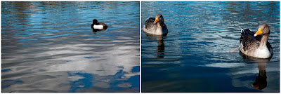
The first two a single point and two points. These images are self-explanatory.
 The next group are those that show implied lines and shapes. I have regrouped them in a collage to clearly show the aspect of design in each image.

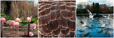
The third group is those of rhythm and pattern. I've put the pattern between the two rhythm pictures.
I hope edit a presentation closer to what Moira has suggested.
She has suggested an edit featuring these images.
Below are the images for the assignment grouped in three blocks.
The first two a single point and two points. These images are self-explanatory.
 The next group are those that show implied lines and shapes. I have regrouped them in a collage to clearly show the aspect of design in each image.
The third group is those of rhythm and pattern. I've put the pattern between the two rhythm pictures.
I hope edit a presentation closer to what Moira has suggested.

Subscribe to:
Posts (Atom)